Handcrafted brand system featuring custom illustrations, laser-cut signage, print collateral, and web design for a vibrant Southern California destination wedding.
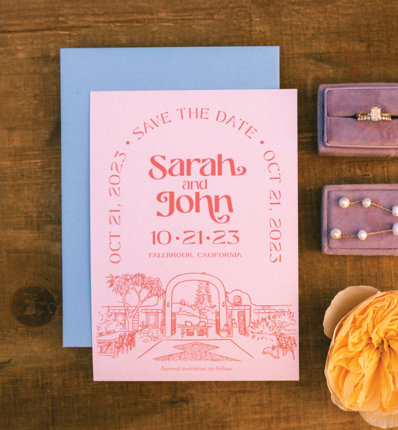
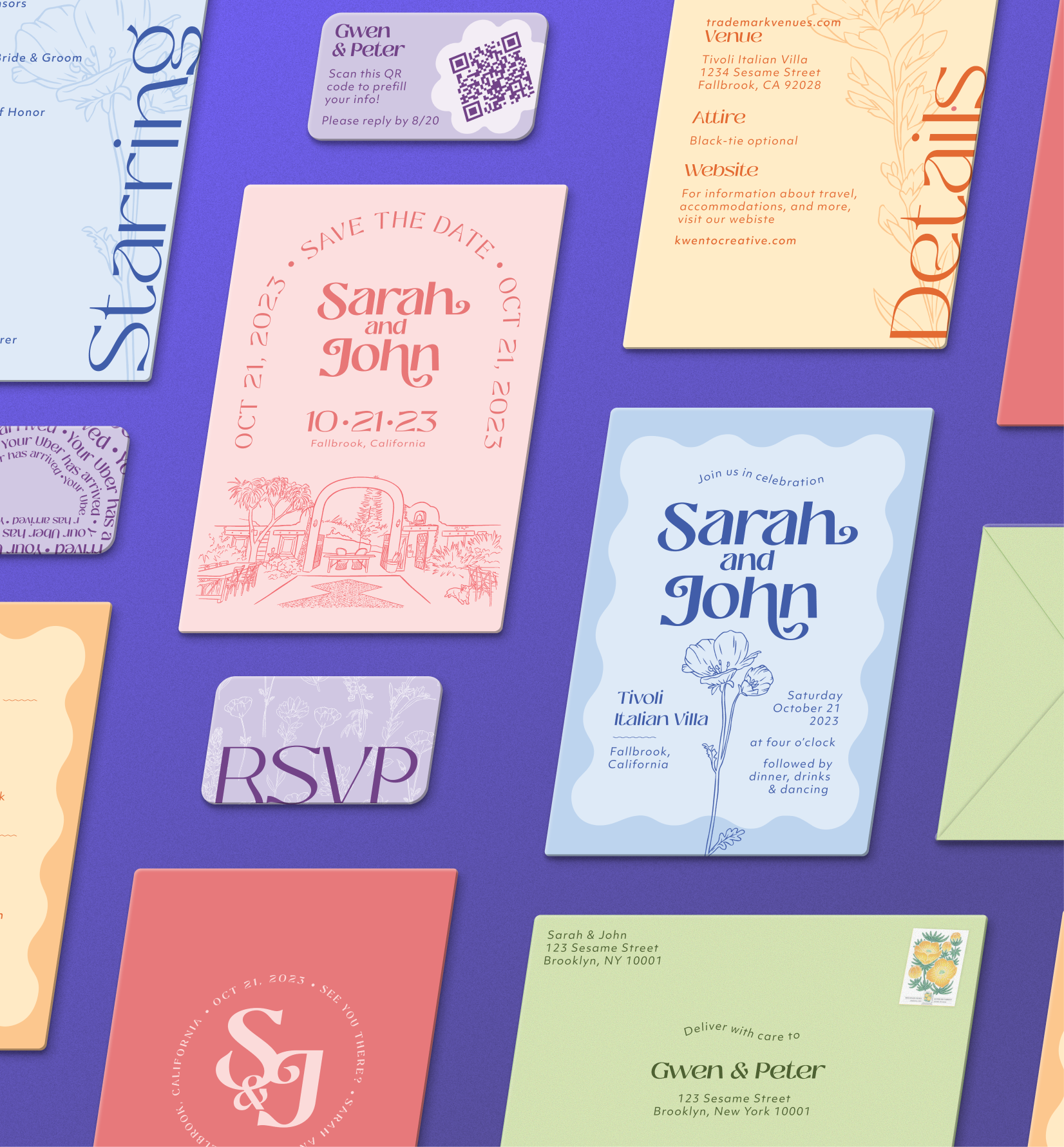
Create a cohesive, vibrant brand identity system for a destination wedding that captures the warmth of Southern California's colorful florals and celebrates Filipino cultural heritage. The system needed to remain functional across 30+ touchpoints, from digital invitations and custom wax seals to laser-cut signage. All physical materials had to withstand disassembly, transport, and reassembly at the San Diego venue.
Visual Identity:
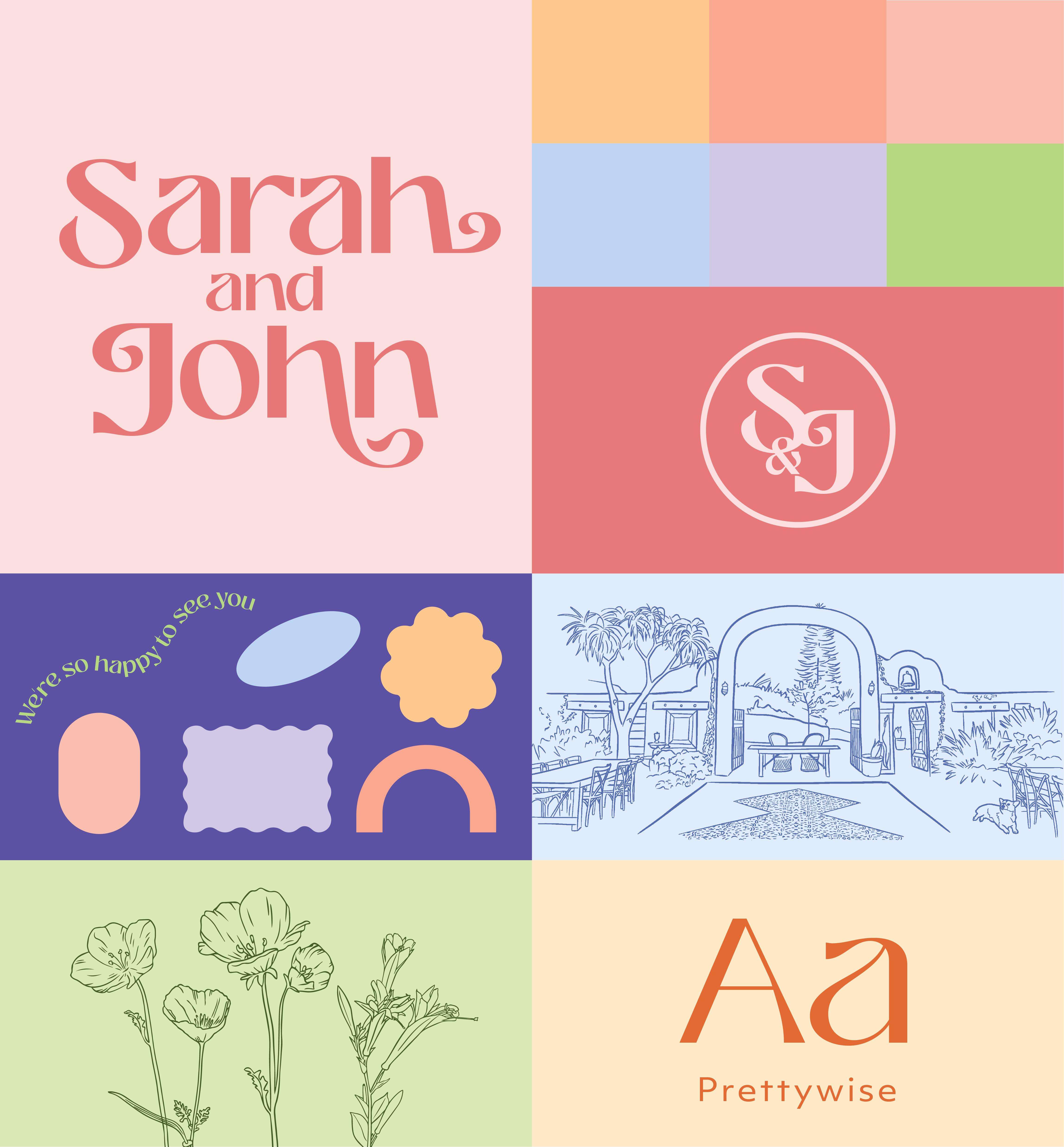
Developed a complete design system centered around hand-drawn California wildflowers, organic shapes, and a carefully curated color palette that would thread through every element of the wedding experience.
Typography:
Selected Prettywise, a font that balances whimsy with modern readability and wedding elegance. The typeface became the foundation for a custom monogram logo combining both partners' initials.
Color Palette:
Built a vibrant, warm palette inspired by California's colorful florals. Each color was intentionally assigned to different invitation suite pieces, creating a complete spectrum when viewed together. Developed darker variations of each color for versatility across applications, with custom paint mixing to ensure perfect color matching on physical materials.
Pattern & Illustration System:
Components Designed:
Design Strategy:
Each piece featured a different color from the brand palette, creating visual variety while maintaining cohesion. Multiple rounds of iteration ensured the formal invitation and details card struck the right balance of information, elegance, and brand personality.
Production:
Self-printed envelopes with custom corgi illustration on the back, adding personal charm while maintaining brand consistency. Each save the date included a hand-applied wax seal created with a custom stamp.
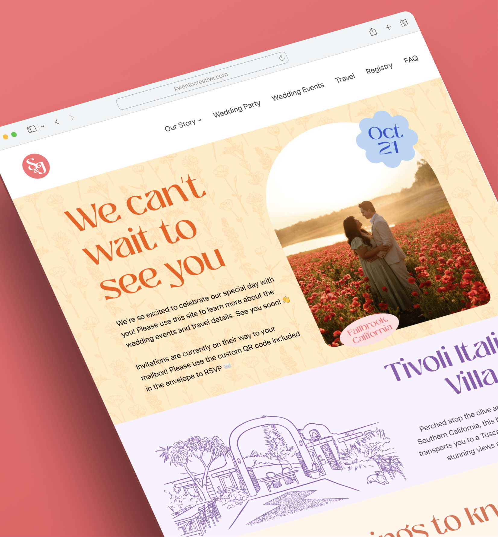
Wedding Website:
Full custom website design featuring hand-drawn icons, complete RSVP functionality, and on-brand visual system throughout. Served as a central hub for guest information and event details.
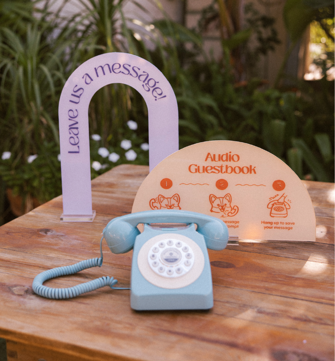
Guest Experience:
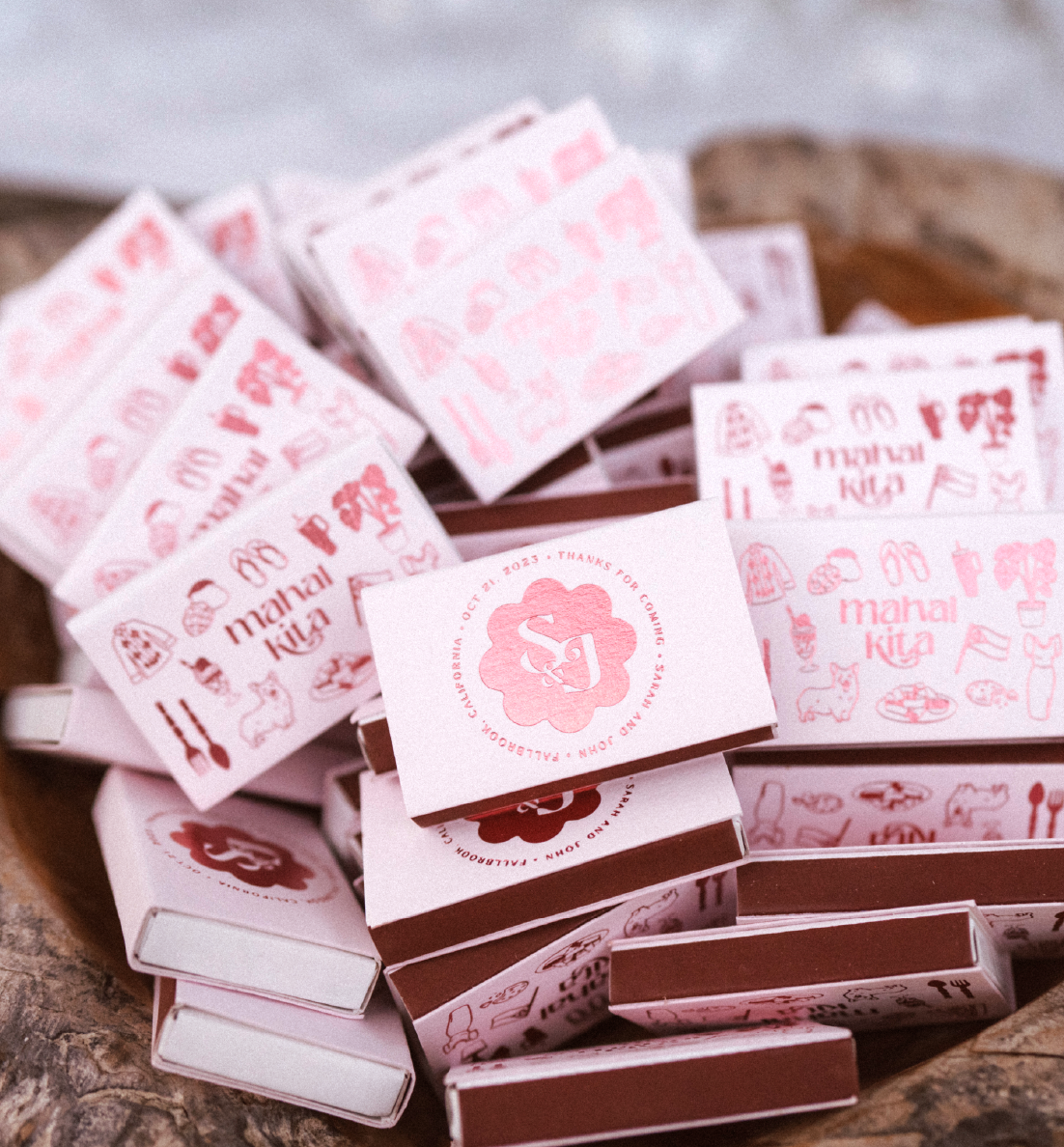
Welcome Gifts:
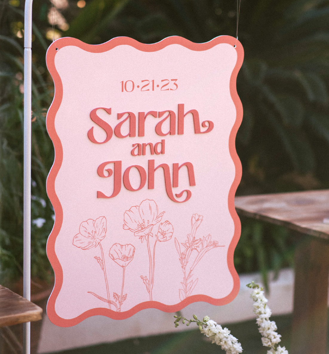
Laser-Cut & Engraved Pieces:
Large-Format Signage:
Hand-Painted Elements:
Color-matched and hand-painted laser-cut pieces to achieve seamless integration with the color palette. Mixed custom paint colors by eye to ensure perfect brand consistency.
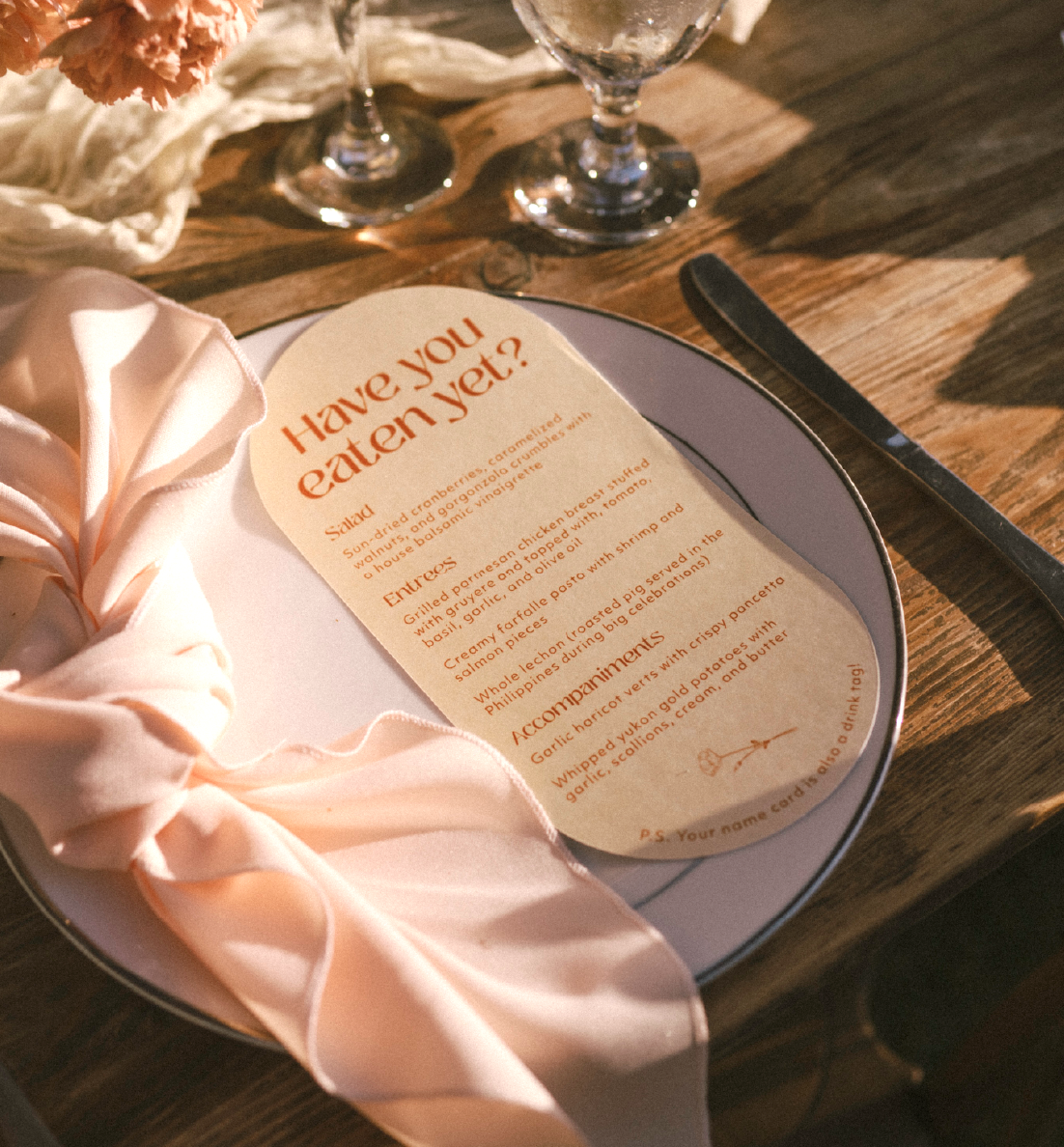
Print Collateral:
Illustration:
Created bespoke illustrations for all beverage and dessert offerings, maintaining the hand-drawn aesthetic while clearly communicating options to guests.
Custom Photobooth:
Designed branded photo backgrounds printed on photobooth takeaways for guests.
Destination Wedding Execution:
Coordinated disassembly, transport, and reassembly of all physical materials from production location to San Diego wedding venue. All pieces were designed to withstand travel while maintaining quality.
Self-Production:
Successfully delivered a comprehensive brand identity system that:
Design Philosophy:
Every element was designed to feel personal, warm, and true to the couple's story while maintaining the elevated design standards expected in professional brand work. The hand-drawn illustrations and custom color palette created an unmistakably unique identity that guests remembered long after the celebration.
A Brooklyn-based design studio helping brands tell their story, one design at a time.